
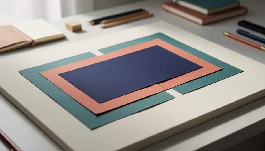
Emphasis in graphic design is the strategic use of visual weight, contrast, and placement to guide a viewer’s eye to the most important element on the page. It answers a fundamental question every designer faces: where should someone look first? By manipulating size, color, typography, spacing, and positioning, you create a clear visual hierarchy that tells your story in the order you choose.
Think of emphasis as the visual equivalent of raising your voice or pausing for effect in conversation. When everything on a page screams for attention, nothing gets heard. But when you deliberately make one element stand out, whether through bold color, dramatic scale, or strategic isolation, you give your audience a clear entry point. This principle applies whether you’re designing a poster, website, social media graphic, or therapeutic art piece meant to express what words cannot.
For our community at Art Therapy Canada, understanding emphasis goes beyond technical design skills. It connects directly to how we process emotions and communicate what matters most. When you de-stress with art you’re naturally emphasizing certain colors, shapes, or areas that reflect your inner state. Learning to recognize and intentionally create emphasis helps you better understand your own visual language and gives you tools to express yourself more clearly.
In 2026, as Canadian design embraces accessibility-as-standard and hyper-personalization, emphasis has become even more critical. Accessible design requires crystal-clear focal points so everyone, regardless of cognitive or visual ability, can navigate content effortlessly. This isn’t just good design practice. It’s an inclusive approach that ensures your message reaches everyone who needs it.
What Emphasis Really Means in Visual Design

When you look at any visual composition, a poster, a painting, a social media graphic, your eye lands somewhere first. That’s emphasis at work. It’s the design principle that determines what you notice before anything else, creating a clear entry point into the visual story.
Think of emphasis as the design equivalent of raising your voice during conversation. In a composition where everything competes equally for attention, nothing stands out, the visual message gets lost. Emphasis solves this by establishing hierarchy, deliberately making one element the star while others play supporting roles. That star becomes your focal point, the anchor that organizes how you experience everything else in the frame.
Here’s where emphasis gets interesting compared to other design principles. Balance distributes visual weight evenly across a space. Contrast creates difference between elements. But emphasis decides which element matters most right now. You can use contrast to create emphasis (a red circle among grey squares), but contrast alone doesn’t guarantee a focal point, you might just have competing differences. Emphasis is the intention behind the technique.
For professional designers, emphasis guides viewers through information in a specific order, critical for clear communication. For art therapists working with clients, emphasis reveals emotional priorities. What someone chooses to make largest, brightest, or most central in their artwork often reflects what weighs heaviest in their internal landscape. A small figure dwarfed by massive background shapes tells a different story than a bold central self-portrait.
Understanding emphasis helps you decode visual messages more consciously and create your own with clearer intent, whether you’re designing a website or processing feelings through paint.
How Designers Create Emphasis (And How You Can Too)
Size and Scale
Size and scale might be the most instinctive way we create emphasis, and it’s how our brains naturally navigate visual information. When one element towers over everything else, we look there first. It’s automatic, primal even. A massive headline dominates a poster. An oversized flower fills a canvas and becomes the emotional center of the piece.
But scale isn’t just about making things big. Sometimes shrinking everything else around a smaller focal point creates even stronger emphasis through contrast. Think of a single word in tiny type, surrounded by expansive white space, it becomes precious, whispered, intimate. In therapeutic art-making, the size you give something often reveals its emotional weight in your inner landscape. That looming figure might represent overwhelming anxiety. That tiny self-portrait tucked in the corner? It could signal how small you’ve been feeling lately.
Color and Contrast
Color works faster than words, your eye finds the bright red circle before you’ve consciously decided to look for it. That’s contrast at work, and it’s one of the most visceral ways to create emphasis in any composition.
A saturated yellow against charcoal gray doesn’t just draw attention; it carries emotional weight. Warm colors like red and orange feel urgent, energetic, sometimes confrontational. Cool blues and greens suggest calm or distance. When you place a vibrant element in a field of muted tones, you’re not just guiding the viewer’s gaze, you’re signaling importance and shaping how they feel about what they’re seeing.
Contrast isn’t limited to hue. Light against dark, warm against cool, or even a single desaturated element in a sea of color all create focal points. In therapeutic art-making, the colors you’re drawn to emphasize often reveal something: choosing to make one part of your drawing vivid while leaving the rest subdued can mirror what feels most present or pressing emotionally. It’s a visual way of saying “this matters most right now.”
Placement and Isolation
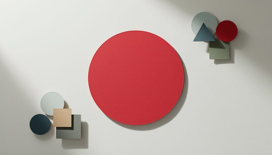
Where you place an element within your composition matters as much as the element itself. Central positioning naturally draws the eye, we’re conditioned to look at the middle of a frame first, but that’s not your only option. Placing something off-center can create dynamic tension that actually increases visual interest and emotional engagement.
White space, or negative space, is your secret weapon. When you surround an element with empty space, you isolate it from competing visual information. Think of a single word floating in the middle of a page, or a small image set against a large expanse of colour. That breathing room forces the viewer to focus. It whispers, “This matters. Pay attention here.”
In therapeutic art-making, notice where you naturally place elements that carry emotional weight. Do you push difficult feelings to the edges? Centre moments of joy? That spatial choice reveals something about how you’re processing the experience. Experimenting with placement, moving that painful memory from the corner to the centre of the page, for instance, can shift your relationship to it. You’re literally giving it different space to exist.
Typography and Visual Weight
Typography carries weight you can feel before you even read the words. A bold, condensed headline pulls your eye instantly, it announces importance, demands attention. Meanwhile, a delicate serif whisper in the corner suggests intimacy, something secondary but worth discovering. This isn’t accident; it’s visual weight, the invisible force that tells viewers what to read first and how to feel about it.
Designers manipulate weight through font choice, size, thickness, and spacing. A heavy sans-serif in all caps creates urgency and command, think warning signs or powerful declarations. A light italic script conveys gentleness, reflection, maybe vulnerability. When you’re working with text in therapeutic art-making, notice what happens when you write a painful word small versus large, in rigid block letters versus flowing cursive. The same word carries completely different emotional resonance depending on its visual treatment. That’s emphasis working through typography, not just guiding the eye, but shaping how the heart receives the message.
Repetition and Breaking Patterns
Patterns create rhythm and predictability, three equal circles in a row, repeating lines of text, identical shapes marching across a page. Your eye settles into the repetition, expecting more of the same. That’s precisely when breaking the pattern grabs attention. Change the size of one circle, shift a single line out of alignment, or introduce an unexpected color, and that disruption becomes your instant focal point. It’s visual tension: the comfort of pattern meeting the surprise of difference. In therapeutic art-making, this technique mirrors how we often need to break our own mental patterns to see what’s been hidden. Establishing and then intentionally disrupting a visual pattern teaches your eye, and your awareness, where meaning lives in the unexpected.
Emphasis as an Emotional Language in Art Therapy
When someone creates art for healing, what they choose to emphasize tells a story their words might not be ready to share. A splash of red in an otherwise grey painting, a face drawn much larger than the surrounding landscape, a single jagged line cutting through gentle curves, these aren’t random choices. They’re emotional breadcrumbs pointing toward what matters most, what hurts most, or what needs attention most urgently.
In therapeutic settings, trained art therapists pay close attention to where emphasis naturally appears in a client’s work. A child who’s experienced household conflict might repeatedly draw one parent figure significantly larger than others, revealing perceived power dynamics. Someone processing grief might use intense color contrast to isolate a memory or person, visually communicating the feeling of loss or separation. These emphatic choices surface unconsciously, bypassing the filters we normally use when talking about difficult experiences.
Art therapy mindfulness practices often include noticing exercises where clients step back from their finished work and simply observe: What draws your eye first? What did you make biggest, brightest, or most detailed? What did you push to the edges? These questions open conversations about emotional priorities and unexamined patterns. The focal point you created reveals what your mind needed to emphasize, even if you weren’t consciously aware of it.
This isn’t about artistic skill. A stick figure drawn with heavy pressure and dark shading carries as much emotional weight as a detailed portrait. The emphasis itself, the visual priority you assigned, becomes the language. Therapists help clients recognize these patterns across multiple sessions, noticing what consistently demands emphasis and what shifts as healing progresses. Over time, clients learn to use emphasis intentionally: highlighting hope instead of fear, bringing forward possibility rather than pain, creating new visual hierarchies that reflect emotional growth rather than trauma.
Emphasis in 2026 Design Trends and Accessibility
The 2026 design styles reshaping Canadian visual culture all depend on one thing: knowing exactly what to emphasize. The 2026 Canadian web design forecast identifies sustainability-first design, hyper-personalization, and accessibility-as-standard as the three trends defining how we communicate visually this year. Each of these movements succeeds or fails based on how clearly it directs attention.
Sustainability-first design uses emphasis to communicate values before aesthetics. Designers highlight eco-friendly materials, carbon-neutral processes, or local sourcing by placing these details prominently, using contrast and scale to make environmental commitments impossible to miss. The focal point shifts from decorative flourish to transparent practice.
Hyper-personalization relies on emphasis to make each user feel seen. Instead of one-size-fits-all layouts, designers create systems where the most relevant content moves to the top based on individual behaviour and preferences. What gets emphasized changes per person, but the principle stays constant: put what matters most to this specific human front and center.
Accessibility-as-standard means emphasis is no longer optional, it’s structural. The WCAG 2.1 accessibility principles require clear visual hierarchy so screen readers can navigate logically and users with cognitive disabilities can find what they need without hunting. Strong emphasis helps everyone, particularly those with attention challenges, visual impairments, or information processing differences. When designers fail to create clear focal points, they don’t just confuse sighted users, they exclude people who rely on well-structured information to navigate independently.
These trends ask the same question therapeutic art-making does: what truly deserves attention? When you answer that honestly, emphasis becomes both an ethical choice and a design decision.
Practical Ways to Explore Emphasis in Your Own Creative Work
You don’t need expensive software or formal training to explore emphasis, just willingness to experiment. These exercises work with whatever materials you have: magazine clippings, colored paper, a phone camera, or a simple sketchbook. The goal is noticing what happens when you make deliberate choices about what stands out.
Start with intentional collage. Gather images and textures that resonate with you emotionally, it could be magazine pages, printed photos, fabric scraps, or natural materials like leaves. Before you glue anything down, arrange pieces on your page and ask yourself: what do I want someone to see first? That element becomes your focal point. Make it larger, place it centrally, or surround it with empty space. Everything else should support or contrast with it. This technique reveals what matters most to you in the moment, which is why therapists often use collage work to explore emotional priorities.
Try these emphasis experiments in sequence:
- Create a collage where one element is significantly larger than everything else, notice how your eye returns to it repeatedly and what feelings that creates.
- Take a personal photo or find an image you connect with, then alter it by adding one bold color or shape that draws attention to a specific area, this works digitally or with markers and paint.
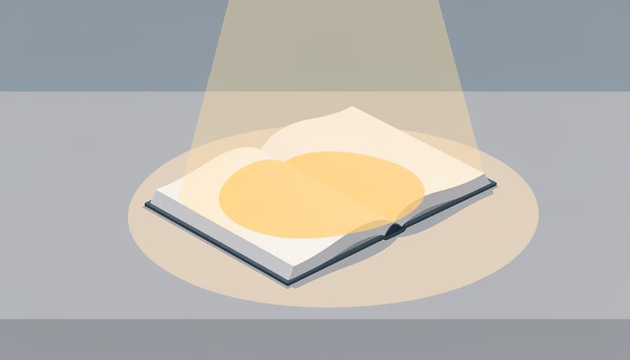
- Use the spotlight technique: on a dark background (black paper or a dimmed digital canvas), place one bright or light-colored element, observe how isolation and contrast create natural emphasis without any other tricks.
Between exercises, pause and notice your emotional response. Does emphasizing one element make you uncomfortable? Does it feel like a relief to declare something important? There’s no wrong answer, your reactions are information about what you’re processing right now, whether you’re working through something specific or simply exploring how visual choices mirror internal states.
Common Questions About Using Emphasis in Design and Art-Making
Can you really mess up emphasis, or is it always subjective?
You can absolutely create too much emphasis, when everything screams for attention, nothing actually gets it. If you’re using five different bold colors, three oversized elements, and dramatic placement all at once, your composition flattens into visual noise. The viewer’s eye doesn’t know where to land first, which creates confusion rather than clarity. In therapeutic work, this might mirror feeling overwhelmed or scattered, and recognizing it in your art can be valuable self-awareness. The solution isn’t to eliminate emphasis entirely but to choose one or two elements that truly matter most and let everything else support them.
How do you know what deserves emphasis in the first place?
Start by asking what you want someone to notice first or remember most. In professional design, this comes from understanding your message, if you’re promoting an event, the date and location matter more than decorative elements. In personal art-making or graphic design for healing pay attention to what you’re naturally drawn to as you create. That instinct often reveals emotional priorities you might not consciously recognize yet. What keeps pulling your attention back? What feels most important to protect or highlight? Trust that intuition, it’s information about what matters to you right now.
Is there a correct way to create a focal point?
There’s no single “right” technique, but effective emphasis feels intentional rather than accidental. Whether you use size, color, placement, or contrast depends on your message and medium, experiment to see what feels authentic to your voice.
What if nothing in my composition feels important?
This flatness can be emotionally significant in therapeutic contexts, possibly reflecting disconnection or numbness. Try adding one small element of emphasis, a splash of color, an isolated shape, and notice how that shift changes your emotional response to the piece.
Can emphasis work differently across cultures?
Yes, color symbolism, reading patterns, and visual hierarchies vary culturally. What feels bold or central in one context might read differently elsewhere, which matters both in inclusive design and in honoring diverse healing practices.
Remember that learning emphasis is about building awareness, not perfection. Notice where your eye lands in designs you encounter daily, posters, websites, even grocery packaging. That observation sharpens your ability to create emphasis intentionally in your own work, whether you’re designing professionally or exploring visual expression as part of your healing journey.
Emphasis isn’t just about making things bigger or brighter. It’s about making conscious choices that reflect what truly matters to you. Every time you choose what to highlight in a design or a personal art piece, you’re making a statement about priorities, values, and emotional truth.
Start noticing emphasis everywhere. Look at the posters you pass on the street, the apps you use daily, the album covers that catch your eye. What draws you in first? Why does it work? That awareness will naturally influence your own creative choices, whether you’re crafting a presentation at work or journaling visually at home.
The beauty of emphasis is that there’s no single right way to use it. Your focal point might be subtle or bold, centered or unexpected, colorful or stark. What matters is that it’s intentional. When you guide attention deliberately, you’re not just creating better compositions; you’re clarifying your own thinking and communicating more honestly.
If you’re curious about exploring visual expression with professional guidance, Art Therapy Canada offers accessible, affordable therapy options that meet you where you are. Sometimes having a trained therapist help you notice what you naturally emphasize in your work can unlock insights you didn’t realize were waiting. Your emphasis choices matter because they reveal what matters to you.
