
Graphic design in 2026 is defined by ten distinct styles that embrace imperfection, sensory richness, and cultural authenticity. This year’s aesthetic has shifted away from the polished minimalism of previous years toward designs that feel human, tactile, and deliberately unfinished. Whether you’re exploring visual creativity for personal expression, mental wellness, or simply want to understand what makes contemporary design look the way it does, these styles offer accessible entry points for everyone.
The trend reports from Adobe, Canva, and VistaPrint all point to the same shift: designers are choosing warmth over precision, chaos over order, and local culture over universal templates. Organic and imperfect design embraces hand-drawn elements and visible mistakes. Collage and layered visual elements stack textures and images in ways that invite the eye to linger. Maximalist, chaotic layouts reject white space in favor of abundant color and pattern.
This movement toward imperfection creates space for all of us to participate in design without feeling like we need expensive software or years of training. Tools like Figma for creative healing have made visual experimentation more accessible than ever, letting you work with these contemporary styles as a form of creative exploration and emotional expression.
What makes 2026’s graphic design styles particularly meaningful is their emphasis on content that touches all our senses, sparks genuine connection, engages playfully, and stays grounded in local culture. These aren’t just aesthetic choices. They reflect a broader desire for authenticity in how we communicate visually.
How We Identified These 2026 Graphic Design Styles
We identified these ten graphic design styles by analyzing three major industry forecasts released for 2026: Adobe’s Creative Trends Forecast, VistaPrint’s Top 10 Graphic Design Trends, and Canva’s Design Trends announcement. Each source independently confirmed a significant departure from the polished, AI-perfect aesthetics that dominated previous years.
What stood out across all three reports was a consistent theme. Canva declared 2026 “the Year of Imperfect by Design,” while Adobe emphasized designs that “touch all our senses, spark connection, engage in a playful way, and are grounded in local culture.” VistaPrint’s analysis reinforced these same values. Together, they revealed a design world moving away from algorithmic perfection and toward something more authentically human.
The styles we’ve included all share this core philosophy: they celebrate the maker’s hand, honor cultural roots, and invite emotional connection. Whether you’re a professional designer or someone exploring creativity for personal expression, these trends reflect what resonates with people right now, designs that feel real, warm, and genuinely made by humans.
1. Organic and Imperfect Design: Embracing Authentic Expression
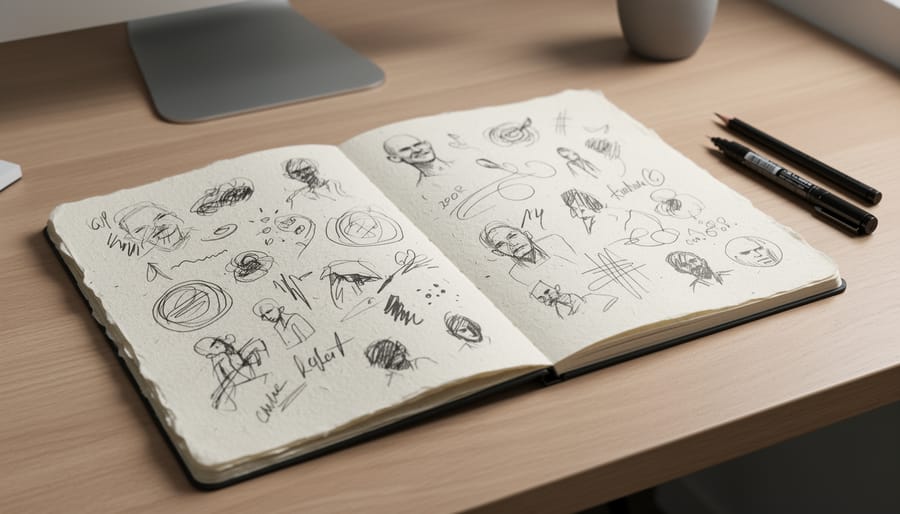
Organic and imperfect design deliberately showcases the human hand behind the work. This 2026 style embraces visible brushstrokes, wobbly lines, and asymmetrical compositions that look like they came from a real person’s sketchbook rather than automated software. You’ll notice hand-lettered text that isn’t perfectly aligned, illustrations with intentional “flaws,” and textures that mimic paper grain or watercolor bleeds.
The style’s defining features include:
- Hand-drawn elements like sketched illustrations and custom lettering
- Irregular shapes that break away from perfect circles and straight edges
- Natural textures such as paper grain, canvas weave, or brush marks
- Visible “mistakes” like ink splatter or uneven spacing left intentionally
- An authentic feel that shows the maker’s presence
This trend stands in direct opposition to the sterile perfection that dominated design in recent years. Where previous styles pursued crisp edges and flawless symmetry, organic and imperfect design values warmth and relatability. The approach resonates because viewers can sense a real person made these choices, experimented with materials, and left their fingerprints on the work.
Adobe identified this as a key 2026 trend because it connects with audiences craving authenticity. When you see a design with slightly irregular hand-drawn borders or text that looks genuinely written rather than typed, your brain registers it as more trustworthy and approachable. The imperfections aren’t careless, they’re deliberate signals that a human created something worth your attention.
2. Collage and Layered Visual Elements: Building Depth Through Composition
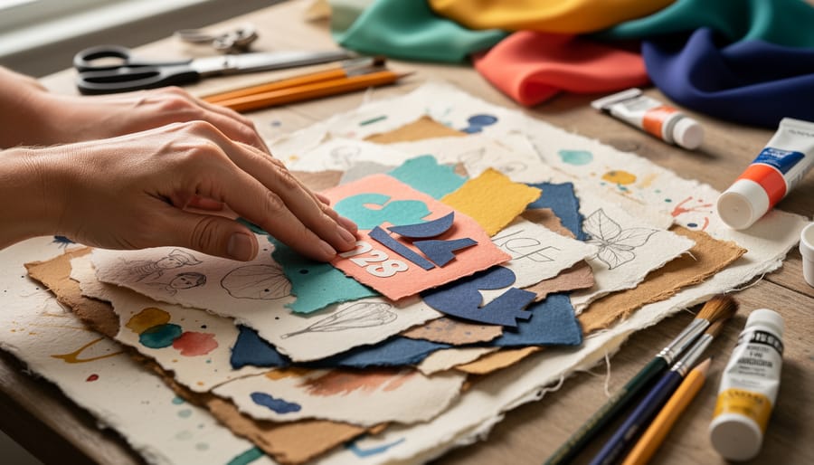
Collage and layered visual elements stack different images, textures, and graphic components on top of each other to create compositions with real depth and dimension. This 2026 design style breaks away from flat, single-layer layouts by combining photographs with hand-drawn sketches, vintage paper textures with digital elements, or torn magazine clippings with bold typography. The result is a visual richness that invites viewers to look closer and discover new details with each glance.
This approach works particularly well for posters, social media graphics, album covers, and editorial layouts where you want to capture attention and hold it. By layering contrasting materials, rough paper grain against smooth gradients, or crisp vector shapes over grainy photos, designers create tension and visual interest that single-image compositions can’t match. The overlapping elements suggest a story being built piece by piece rather than delivered all at once.
What makes collage trending in 2026 is its unmistakably human quality. Unlike AI-generated images that feel seamless and uniform, collage shows the seams deliberately. You see where one layer ends and another begins, where the artist made choices about placement, scale, and overlap. This visible construction process gives the work personality and warmth, making viewers feel they’re engaging with a creator’s vision rather than an algorithm’s output. The style also allows for mixing digital tools with scanned real-world materials, blending the physical and digital in ways that feel authentic rather than overproduced.
3. Maximalist, Chaotic Layouts: Celebrating Visual Abundance
Maximalist, chaotic layouts flip the script on the clean minimalism that dominated design for years. Instead of white space and restraint, this style piles on bold colors, overlapping images, clashing patterns, and multiple focal points competing for attention. The result looks busy, even overwhelming at first glance, but that visual density is the point. It mirrors how we actually experience the world: layered, loud, and full of competing stimuli.
This approach creates immediate energy and emotional impact. A maximalist poster or website doesn’t whisper, it shouts. Dense compositions force the viewer to linger, discovering new details each time they look. Bright neon palettes collide with rich jewel tones. Typography crowds the frame, sometimes at odd angles or sizes. Elements bleed off edges. Nothing is subtle, and that’s what makes it effective for brands or messages that want to stand out and make people feel something strong.
The chaotic aspect isn’t randomness, it’s controlled chaos. Designers intentionally break grid systems and hierarchy rules to build tension, surprise, and a sense of liveliness. For anyone exploring personal creative projects, maximalism offers permission to experiment without perfection. You can layer magazine cutouts, clash patterns, and cram colour into every corner. Some people find that building these visually abundant compositions connects with art therapy mindfulness practices, where the act of adding layers becomes meditative despite the busy result. The style celebrates abundance over restraint, making it a visceral, unapologetic form of expression.
4. Motion-Driven Design: Adding Kinetic Energy
Motion has become a defining feature of 2026 graphic design, transforming static layouts into dynamic experiences that capture attention and convey emotion through movement. This style includes animated logos, kinetic typography that dances across the screen, micro-interactions that respond to scrolling or clicking, and transitions that guide the eye through a composition. Rather than treating motion as a novelty, designers now use it as a fundamental communication tool, a shift away from stillness toward rhythm and flow.
Dynamic typography is especially prominent, with letters that stretch, bounce, or shift weight as viewers interact with them. These animated type treatments make words feel alive, turning messages into performances that reinforce meaning through movement rather than just shape. The approach works across digital platforms, from social media stories to website headers, creating memorable moments that static text cannot match.
Motion-driven design also includes looping animations, parallax scrolling effects, and illustrations that reveal themselves gradually. These elements add energy without overwhelming the viewer, using controlled movement to build narrative and maintain engagement. The result is design that feels kinetic and responsive, inviting interaction while delivering information in a more engaging, human-centered way that aligns with 2026’s broader shift toward sensory and emotional connection.
5. Sensory-Engaging Design: Touching All the Senses
Sensory-engaging design goes beyond the visual, creating graphics that suggest texture, sound, movement, and even scent through purely visual means. This 2026 style uses techniques like grain overlays, rough paper textures, and tactile typography that looks like it was carved, stitched, or stamped. When you see a design with visible brush strokes or embossed-looking letters, your brain imagines the feeling of running your fingers across that surface.
Designers achieve this multisensory effect by combining high-contrast textures, dimensional shadows, and materials that reference the physical world. A poster might feature typography with a fabric weave pattern, layered with photography that shows glossy surfaces next to matte finishes. Color gradients can suggest warmth or coolness. Wavy lines and flowing shapes imply sound and rhythm.
This approach makes designs more memorable and emotionally engaging. Rather than communicating through imagery alone, sensory-engaged graphics trigger associations with physical experiences. A coffee brand might use steam-like wisps and coffee-bean textures that almost let you smell the roast. A music festival poster could incorporate vibrating text and sound-wave patterns that visually echo beats and melodies.
The immersive quality of this style works particularly well in digital formats where actual touch isn’t possible, bridging the gap between screen and sensation through visual suggestion.
6. Connection-Focused Design: Building Human Bonds
Connection-focused design prioritizes emotional resonance and human interaction through deliberate visual choices that invite viewers into a shared experience. This 2026 style centers on warm color palettes, terracotta, soft blush, honey tones, that create psychological safety and approachability. Relatable imagery shows real people in authentic moments rather than stock-perfect scenarios, while inclusive visual language represents diverse bodies, ages, abilities, and cultural backgrounds without tokenism.
The style uses eye contact in photography, conversational typography that speaks directly to viewers, and compositional choices that guide the eye in welcoming patterns rather than confrontational hierarchies. Negative space functions as breathing room, preventing visual overwhelm while creating openness. Color transitions are gradual rather than jarring, supporting a sense of continuity and belonging.
This approach appears across community-focused campaigns, brand identities for care services, and public art initiatives like murals for mental health that transform shared spaces into conversation starters. The design choices signal “you belong here” through visual cues that feel personally relevant rather than generically appealing.
Connection-focused design rejects cold corporate aesthetics in favor of warmth and accessibility, recognizing that design mediates human relationships and can either build bridges or reinforce distance.
7. Playful and Experimental Typography: Words as Art
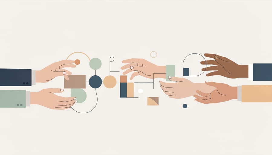
Experimental typography in 2026 throws out the rulebook, treating letterforms as visual art pieces rather than mere carriers of information. Designers are distorting letters, stretching them beyond recognition, layering multiple typefaces in one word, and creating custom letterforms that challenge readability while amplifying emotional impact. This approach embraces irregularity, letters might dance across the page, morph into illustrations, or fragment into abstract shapes.
The style reflects the broader shift toward imperfection and human touch in 2026 design. Where previous years favored clean, uniform typography, this trend celebrates wonky baselines, inconsistent letter spacing, and deliberately clashing font combinations. Text becomes texture, contributing to a composition’s visual weight and movement rather than simply conveying words.
This playful approach works especially well for headlines, social media graphics, and brand identities that want to stand out from algorithmically-generated sameness. You might see vintage serif fonts colliding with futuristic sans-serifs, or hand-lettered elements integrated with digital type. The key is intentionality, these aren’t mistakes but deliberate choices that make typography memorable and emotionally resonant. Anyone can experiment with this style using free design tools, mixing fonts unexpectedly or hand-drawing letters to create unique, expressive text compositions.
8. Locally-Grounded and Culturally-Rooted Design: Celebrating Community
Locally-grounded and culturally-rooted design pulls from the visual language of specific regions, neighborhoods, and communities rather than defaulting to the same globalized aesthetic everywhere. This style uses motifs, color palettes, traditional patterns, and storytelling methods rooted in particular places and cultures, creating work that feels distinctive and meaningful to the people it represents.
In practice, this might look like incorporating Indigenous art forms, local folklore imagery, regional typography styles, or color combinations tied to cultural celebrations. A poster for a community event might reference the area’s architectural details, historical symbols, or craft traditions. Digital designs might adopt visual cues from street art, textile patterns, or religious iconography specific to that culture.
This approach counters the flattening effect of global design trends where everything starts to look identical, whether it’s made in Vancouver or Seoul. By drawing on local and cultural roots, designers create work that speaks directly to a specific audience’s lived experience and shared history, which builds authentic connection.
If you’re interested in exploring design from this perspective, you can choose a design program that emphasizes cultural context and community engagement. Working with locally-grounded design can also serve as one of many de-stress strategies by connecting you to heritage and place in a creative way. This style celebrates diversity rather than erasing it, honoring the visual richness that comes from different cultural perspectives.
9. Textured and Tactile Elements: Creating Visual Depth
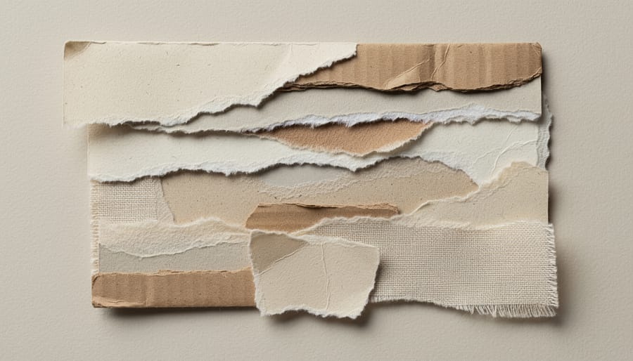
Textured and tactile elements transform flat digital designs into visually rich experiences that feel almost touchable. This 2026 style incorporates visible paper grain, canvas weave, brush strokes, and surface imperfections that suggest physical depth. Think scanned materials, rough-edged shapes, and layered surfaces that catch the eye and create warmth.
Designers achieve this look by adding noise filters, overlaying texture images, using raster brushes instead of crisp vectors, or photographing actual materials to incorporate into digital compositions. The result mimics screen-printed posters, letterpress cards, or handmade collages, making digital work feel crafted rather than generated.
This approach works across applications: websites with grainy backgrounds, social media graphics with visible paper textures, digital illustrations that look painted, or branding that suggests handmade quality. The tactile quality draws viewers in and makes designs memorable because they break the smooth, clinical look that dominates much of the digital landscape.
You can explore this style regardless of your skill level. Many design tools now include texture overlays and brushes that create these effects. Even scanning fabric, paper, or found materials and layering them digitally can produce compelling results. The goal is adding visual interest and human warmth through surfaces that suggest real-world materials and the passage of time.
10. Human-Centered Design Over AI Perfection: Keeping the Artist Visible
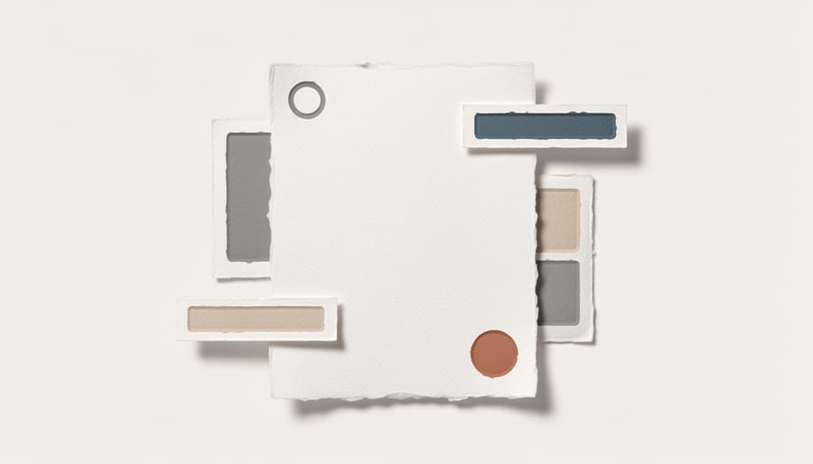
This design approach deliberately showcases the human hand behind the work. You’ll see visible brushstrokes in digital paintings, uneven lettering in custom typography, and compositions that feel personally crafted rather than algorithm-generated. The style emerged as a direct response to the flood of AI-produced imagery, designers and viewers alike craved evidence of a real person making creative decisions.
The hallmark of this trend is intentional imperfection. A designer might leave rough edges on illustrations, use hand-drawn elements alongside digital ones, or incorporate visible process marks like sketch lines or texture overlays. These choices signal that a human being sat with the project, made thoughtful decisions, and left their unique mark on the final piece.
Unlike the flawless gradients and perfectly symmetrical layouts that AI tools generate effortlessly, human-centered design values the quirks. A letterform might tilt slightly. Colors might clash in an interesting way. Spacing might break the grid. These aren’t mistakes, they’re proof of artistic intention and individual style.
For anyone wanting to explore this approach, graphic design tutorials often walk through techniques that preserve your personal touch. The key is resisting the urge to smooth everything into perfection and instead letting your natural creative voice show through your work.
Using Graphic Design Styles for Self-Expression and Growth
You don’t need professional design software or formal training to experiment with these 2026 graphic design styles. Free digital tools like Canva offer templates reflecting organic layouts, collage elements, and maximalist compositions that you can customize for personal projects. Even basic smartphone apps let you layer images, add textures, and play with unconventional typography on social media graphics, digital vision boards, or creative posts.
Paper-based approaches work just as well for exploring these design principles. Visual journaling naturally incorporates many 2026 trends: you might collage magazine clippings with hand-drawn elements for that imperfect, human-centered aesthetic, or experiment with chaotic layouts by filling pages with overlapping images, text fragments, and patterns. Scrapbooking embraces textured, tactile elements and connection-focused design when you preserve memories through layered compositions that feel personally meaningful rather than digitally perfect.
These styles encourage creative self-expression precisely because they reject polish and precision. Your wobbly hand-lettering, uneven collage edges, and experimental color combinations align perfectly with the “Imperfect by Design” philosophy that defines 2026 trends. Whether you’re creating digital art, decorating a planner, designing greeting cards, or simply playing with visual ideas in a sketchbook, these approaches value your authentic creative voice over technical perfection. The emphasis on human touch means your work doesn’t need to look professionally executed to be visually engaging and personally significant.
How We Chose This List
We selected these ten graphic design styles by analyzing three major industry forecasts released in late 2025 and early 2026: Adobe’s 2026 Creative Trends Forecast, VistaPrint’s Top 10 Graphic Design Trends for 2026, and Canva’s 2026 Design Trends announcement. Our criteria focused on styles that appeared across multiple authoritative sources, indicating genuine industry momentum rather than isolated predictions.
We prioritized trends that align with the overarching 2026 theme identified by Canva as “the Year of Imperfect by Design”, styles that emphasize human authenticity over algorithmic perfection. Each style needed to represent a distinct visual approach with clear characteristics that anyone can recognize and explore, whether in professional design work or personal creative projects.
We also looked for styles that reflect Adobe’s identified shift toward content that touches all our senses, sparks connection, engages playfully, and draws from local culture. This meant favoring approaches that feel accessible and human-centered rather than requiring expensive software or professional training. The result is a list grounded in verified 2026 design industry research, capturing where contemporary graphic design is actually heading.
Frequently Asked Questions About 2026 Graphic Design Styles
What makes 2026 graphic design styles different from previous years?
The 2026 styles represent a deliberate shift away from AI-generated perfection and minimal aesthetics toward human-centered, imperfect design. Adobe’s 2026 Creative Trends Forecast emphasizes sensory engagement, cultural grounding, and visible authenticity rather than the polished uniformity that dominated earlier years.
Do I need professional software to try these styles?
No, many of these styles are accessible through free tools and basic materials. Organic and imperfect elements can be created with paper collage and smartphone photography, while platforms like Canva offer templates incorporating 2026 trends at no cost.
How do imperfect designs connect with viewers?
Imperfect designs reveal the maker’s hand and human decision-making process, creating emotional resonance that polished work often lacks. When viewers see visible brushstrokes, irregular shapes, or hand-drawn elements, they recognize another person’s creative expression rather than algorithmic output, which builds genuine connection.
Can these styles be combined?
Yes, combining styles is encouraged and reflects the experimental spirit of 2026 design trends. You might layer textured elements within a maximalist layout, incorporate playful typography into culturally-grounded compositions, or blend motion with collage techniques to create something uniquely yours.
These questions reflect common concerns for anyone exploring current graphic design approaches. Whether you’re creating social media graphics, personal art projects, or experimenting with visual expression, understanding these foundational aspects helps you make informed choices about which styles resonate with your creative goals. The accessibility of 2026 trends means you can start experimenting immediately without specialized training or expensive tools.
The graphic design styles defining 2026 reflect a collective shift toward celebrating what makes us human. These approaches reject algorithmic perfection and embrace the messy, textured reality of creative expression. Whether you’re drawn to organic imperfection, layered collage work, maximalist energy, or culturally-rooted visuals, these styles invite you to experiment without pressure to achieve flawless results.
You don’t need professional training or expensive software to explore these design directions. Start with what you have, sketch ideas by hand, layer images in free tools, mix textures, play with color combinations that feel right to you. The 2026 design landscape values authenticity over polish, connection over perfection. Your unique perspective and willingness to try something new matter more than technical skill. These styles exist for everyone who wants to create, communicate, or simply see what happens when you let your creative instincts guide you.
